ENERGY, MOON & SUN
Elements that are part of human routine throughout your life. They reflect our mood, inspire us and are also capable of generating a connected presence that we call the creative state. Flow.
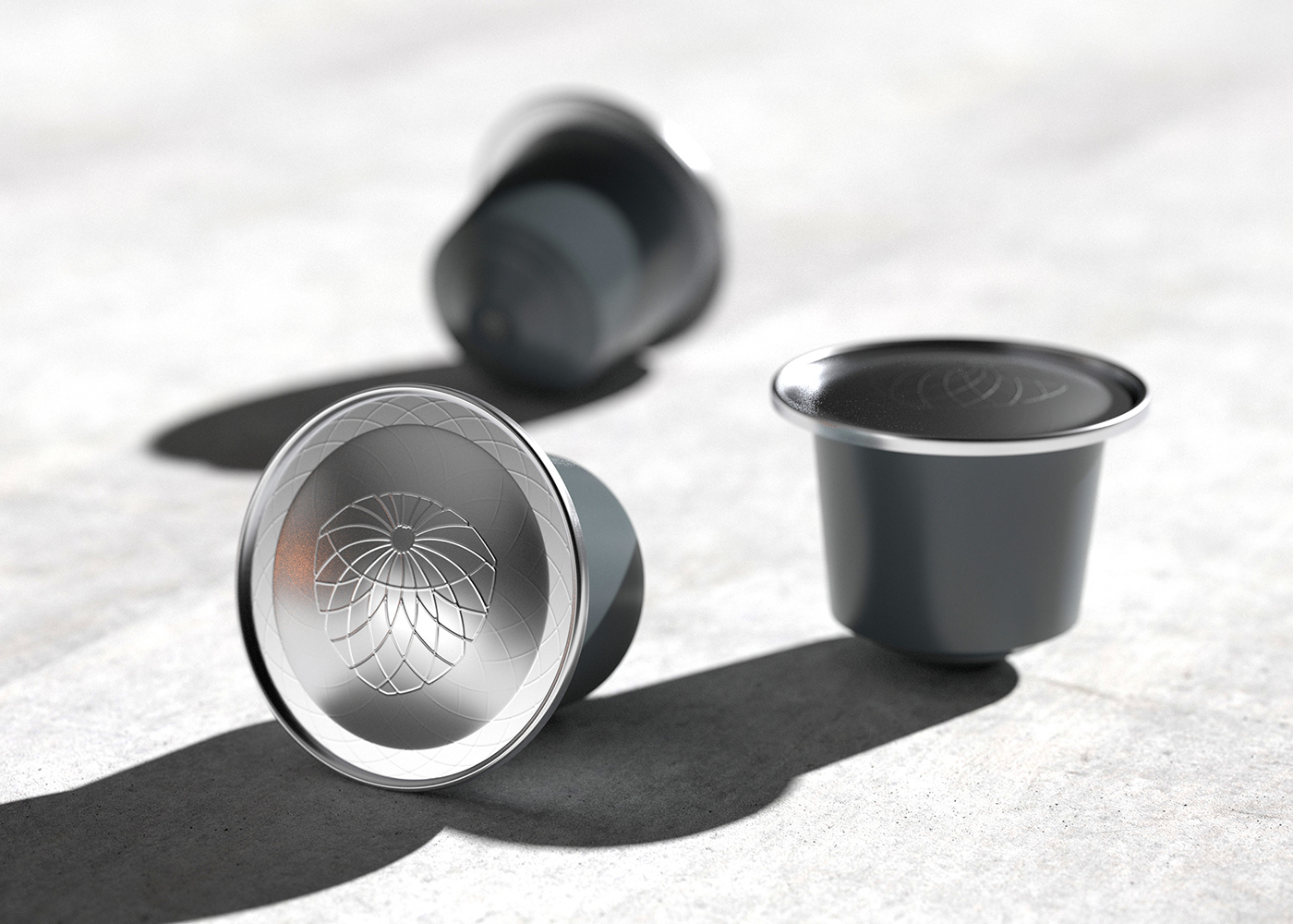
The desire of the CONDE brand was that these same elements were placed as a starting point for the visual conception of communication and products. In this sense, a strong identity proposal, aligned with the consumer market of one of the most popular drinks in the world.
A special detail, despite the North American founders, its main product has roots in Latin America. I am referring to Brazil, a fertile region for the planting and cultivation of coffee. At this point you begin to connect the dots and understand the presence of the color green and the origin of the brand name. I'm talking about a fruit that arrived in Brazil around 1926 by the "Conde de Miranda", since then it has been known in some regions of Brazil as "Fruta do Conde" (Sugar Apple/ Sweetsop). Now you know where the fruity notes of coffee come from, an experience exclusive to the brand.
___________
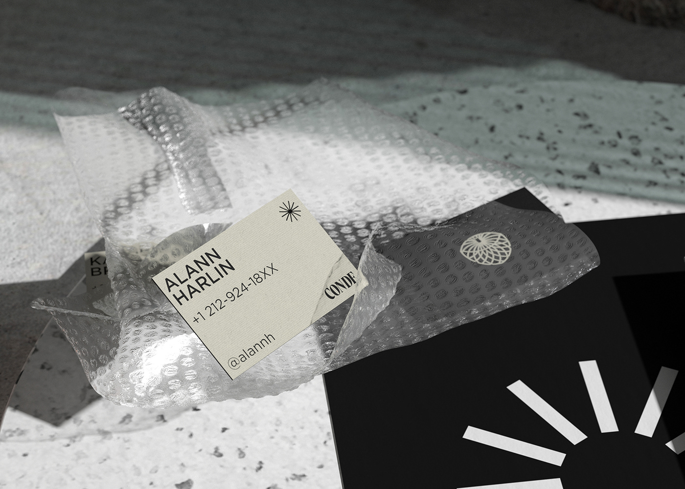
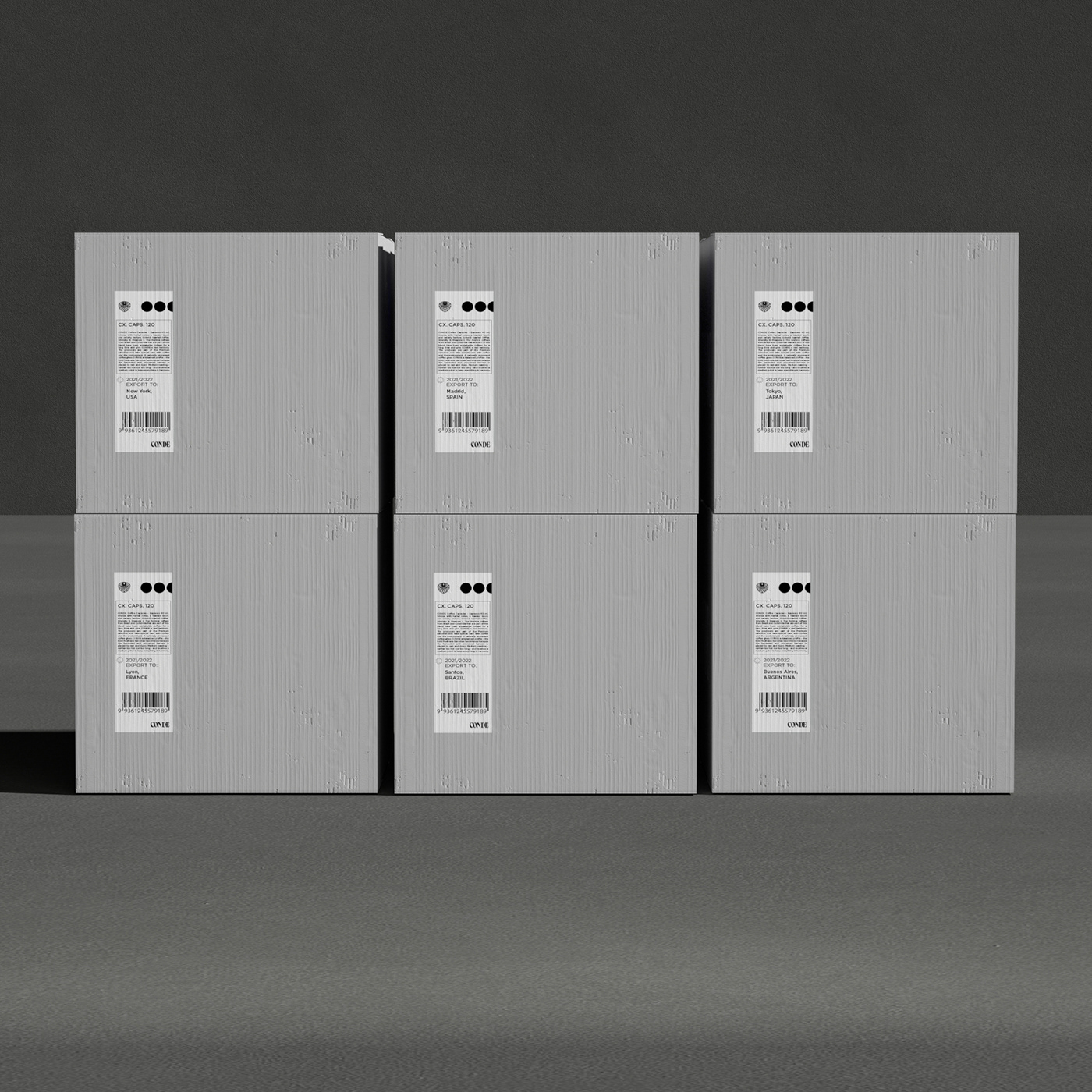
DELIVERABLE: BRANDING SYSTEM / PACKAGING DESIGN
-
2021
by JUNIOR FERPAZZI
2021
by JUNIOR FERPAZZI